Deceptive Box Art
One thing that frequently pissed me off as a kid was the box art of video games. Especially old NES games. It never failed. The box would feature gorgeous artwork, but turn on the game and...
Where is it?!
I hated it when the box art misrepresented the game. I felt cheated, and I know it jaded me for life. Here are some of the worst offenders.

Teenage Mutant Ninja Turtles 3
See the box? That's a Triceraton on the cover. Hell yeah, cool! But surprise! There's not a single Triceraton in the game! As a kid, this pissed me off. As an adult, I wonder what happened. Didn't the box art guys and the game designers talk to each other? I was disappointed, but the game is quite good, so I wasn't devastated.
Wolfenstein 3D
Ah, time for a real letdown. Look at the box art of the original game. It shows these dramatic, hollywood-esque images of a burly Rambo-style hero mowing down Nazis with a minigun. Then you install the game, and the pixels just barely form the suggestion of recognizable enemies.
Believe me, I understand the limitations of graphics in the early 90's, but for the love of God why does the box art have to look better than the game?! It made me wish I was playing THAT game!
American McGee's Alice
Even as late as 1998 game graphics hadn't quite caught up to what the concept art looked like. Images like this:

and this

made me think holy shit this is gonna be orgasm in my eyes! Buuuuut it turns out the Quake 3 engine is outstanding at rendering internal environments, but totally sucks at external ones. Furthermore, most of the characters have this vacant stare going on, especially the rabbit and the griffin.
That image above, the tea party with the Hatter? Never happens in the game. The boss fight with the Hatter is actually disappointing. He doesn't do anything but walk around and be threatening. Just stay away from him and you'll beat him eventually after a few hundred hits.
It's not a bad game. Hell no, the game is fucking awesome! I just wish it had been made during a time when the game engine could do justice to the promotional art. Maybe I'll get my wish.
Schizm
The biggest offender of game art misrepresenting the final product. I bought this title on a whim around when it first came out. The box art was gorgeous--absolutely jaw-dropping, and I had just bought a computer that could handle it. So I paid fifty bucks, waited over an hour for a full install, loaded it...
...and the graphics looked like Realplayer on 28.8. Blocky, stuttering, full of compression artifacts. I couldn't make out anything I was looking at. I sensed there was a beautiful vista of an alien landscape in the distance, but I couldn't see it because the pixels were the size of cockroaches!
Had I done something wrong? I reinstalled the game, and another hour later, same result. The graphics were terrible. I checked my system specs and they exceeded the game's minimum. What was wrong?
I was reduced to searching the internet for answers. It took some digging, but it turns out there were two versions of the game, one for CD-ROM, the other for DVD-ROM. The CD-ROM version had much-reduced graphical quality, while the DVD version had the real deal. The game company used screenshots from the DVD edition as the box art for the CD edition!
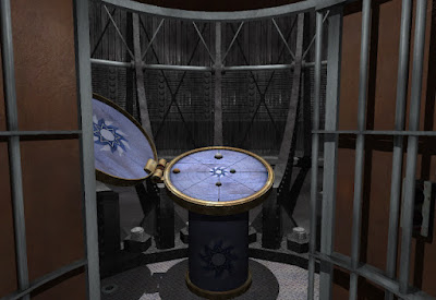
THIS is the DVD version:
Now imagine those graphics like this (image taken from the Just Adventure forum, click to enlarge):

and you have the CD-ROM graphics.
Understand that this was 2002. DVD drives were not standard equipment on computers back then. They were up in the $200-$500 range at the time, so it wasn't as simple as just buying a DVD drive for my computer. On top of that, no stores carried it because there was no market for it yet.
The box promised a gorgeous game! I wanted to play that game, not this piece of blocky shit. It was a dirty trick to bait us with the box art from the DVD version, and then deliver terrible graphics. Talk about deception--that should’ve been illegal! I wrote an email to the company venting my frustration. The answer I got back read something like: "If you would like to exchange the CD version for the DVD version, we can arrange this."
I was so pissed I threw the game in the trash. The company cheated me and there was nothing I could do about it. There wouldn't be anything I could do about it for years, until DVD drives became cheaper. I have since searched for the DVD version of the game, but it's very hard to come by, and from what I've read the game itself is not worth it. To my surprise I don't find a lot of people mentioning how bad the graphics are on the CD edition. I couldn't have been the only one who was deceived.
These days, graphics have come a long way. The box art finally matches the game itself! In fact, there's no such thing as box art. The graphics are so good developers just use screenshots for the box! Finally, honesty!
Where is it?!
I hated it when the box art misrepresented the game. I felt cheated, and I know it jaded me for life. Here are some of the worst offenders.
Teenage Mutant Ninja Turtles 3
See the box? That's a Triceraton on the cover. Hell yeah, cool! But surprise! There's not a single Triceraton in the game! As a kid, this pissed me off. As an adult, I wonder what happened. Didn't the box art guys and the game designers talk to each other? I was disappointed, but the game is quite good, so I wasn't devastated.
Wolfenstein 3D
Ah, time for a real letdown. Look at the box art of the original game. It shows these dramatic, hollywood-esque images of a burly Rambo-style hero mowing down Nazis with a minigun. Then you install the game, and the pixels just barely form the suggestion of recognizable enemies.
Believe me, I understand the limitations of graphics in the early 90's, but for the love of God why does the box art have to look better than the game?! It made me wish I was playing THAT game!
American McGee's Alice
Even as late as 1998 game graphics hadn't quite caught up to what the concept art looked like. Images like this:

and this

made me think holy shit this is gonna be orgasm in my eyes! Buuuuut it turns out the Quake 3 engine is outstanding at rendering internal environments, but totally sucks at external ones. Furthermore, most of the characters have this vacant stare going on, especially the rabbit and the griffin.
That image above, the tea party with the Hatter? Never happens in the game. The boss fight with the Hatter is actually disappointing. He doesn't do anything but walk around and be threatening. Just stay away from him and you'll beat him eventually after a few hundred hits.
It's not a bad game. Hell no, the game is fucking awesome! I just wish it had been made during a time when the game engine could do justice to the promotional art. Maybe I'll get my wish.
Schizm
The biggest offender of game art misrepresenting the final product. I bought this title on a whim around when it first came out. The box art was gorgeous--absolutely jaw-dropping, and I had just bought a computer that could handle it. So I paid fifty bucks, waited over an hour for a full install, loaded it...
...and the graphics looked like Realplayer on 28.8. Blocky, stuttering, full of compression artifacts. I couldn't make out anything I was looking at. I sensed there was a beautiful vista of an alien landscape in the distance, but I couldn't see it because the pixels were the size of cockroaches!
Had I done something wrong? I reinstalled the game, and another hour later, same result. The graphics were terrible. I checked my system specs and they exceeded the game's minimum. What was wrong?
I was reduced to searching the internet for answers. It took some digging, but it turns out there were two versions of the game, one for CD-ROM, the other for DVD-ROM. The CD-ROM version had much-reduced graphical quality, while the DVD version had the real deal. The game company used screenshots from the DVD edition as the box art for the CD edition!
THIS is the DVD version:
Now imagine those graphics like this (image taken from the Just Adventure forum, click to enlarge):

and you have the CD-ROM graphics.
Understand that this was 2002. DVD drives were not standard equipment on computers back then. They were up in the $200-$500 range at the time, so it wasn't as simple as just buying a DVD drive for my computer. On top of that, no stores carried it because there was no market for it yet.
The box promised a gorgeous game! I wanted to play that game, not this piece of blocky shit. It was a dirty trick to bait us with the box art from the DVD version, and then deliver terrible graphics. Talk about deception--that should’ve been illegal! I wrote an email to the company venting my frustration. The answer I got back read something like: "If you would like to exchange the CD version for the DVD version, we can arrange this."
I was so pissed I threw the game in the trash. The company cheated me and there was nothing I could do about it. There wouldn't be anything I could do about it for years, until DVD drives became cheaper. I have since searched for the DVD version of the game, but it's very hard to come by, and from what I've read the game itself is not worth it. To my surprise I don't find a lot of people mentioning how bad the graphics are on the CD edition. I couldn't have been the only one who was deceived.
These days, graphics have come a long way. The box art finally matches the game itself! In fact, there's no such thing as box art. The graphics are so good developers just use screenshots for the box! Finally, honesty!


Old Capcom games were the worst when it came to the box art not matching the game whatsoever.
ReplyDeletehttp://upload.wikimedia.org/wikipedia/en/0/03/Super_Mario_Bros._box.png
ReplyDeleteBam. Honesty?
@creepy anonymous person: That's one NES game that wasn't afraid to show what it really was! Pixels were cool back then!
ReplyDelete@Dan: I don't remember too many Capcom games like that. Any examples?